Last night, while casually browsing Netflix on the web, I stumbled on a small design flaw that unexpectedly broke my flow.
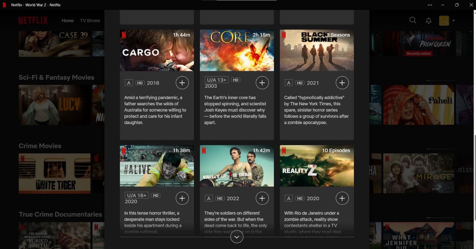
When you click on a movie and scroll down to the “More Like This” section, each recommendation card shows:
- A thumbnail
- A short description
 But no clear movie title before the description.
Not every thumbnail is easily readable — fonts vary, contrast is sometimes low, and text placement is inconsistent. I found myself pausing just to figure out what I was even looking at. It turned a smooth scroll into a moment of friction.
![]() What if there was a simple, readable title placed right above the description?
What if there was a simple, readable title placed right above the description?
No second-guessing. No squinting. Just clear, effortless browsing.
Small UX details like this may seem minor, but they can make or break the overall experience — especially in content-heavy platforms where speed and ease matter most.
Curious if anyone else noticed this or has thoughts on similar “invisible UX” hiccups?